Nothing PersonalNothing Personal

Summary for September 2024

A whole wide witchy world

A very small figure of April Ryan, a short-haired brunette, stands on a country road. There are some small wooded buildings, probably a house and a barn, off to her left, with huge sunflower-like flowers behind a small fence. To her right, there is a small herd of animals that looks like an elephant-bull hybrid. Further out, lush green mountains, stretching far into a bluish haze under fluffy white clouds. There are also two huge statues of humanoids blowing into horns.

I don’t need a “it’s a game from a quarter of a century ago” qualifier to say that The Longest Journey is a great game. Because there is not much to qualify. Sure, it’s not perfect, nothing is. But the story is good, the puzzles are logical, it’s still pretty and very charming. Quite progressive in places, too.

Like many fairy tales, Tchia is a bit dark. It’s also a bit junky in that indie way. But overall, a very good game! A sort of Breath of the Wild and The Wind Waker hybrid. Plenty to do, collect, discover and customise.

Girl with short red hair, wearing a white jacket, dark pants and boots, glides on a zip line towards a concrete tower. Below her is a sandy desert, to her right is a large concrete building, and to her left are some white tube-shaped missile debris. On the horizon is an ominous red storm with white clouds swirling around it.

A significant element of both Caravan SandWitch and Mika and the Witch’s Mountain stories is how capitalism is ruining it for all of us. In both games you traverse a decently sized open world. You help the community, collect things and find secrets. There are non-humanoid people around, and they both have witches. The same game?

I’m kidding, but there are surprisingly many similarities, apart from the obvious: in Caravan you drive a van, but in Mika you fly on a broom. By the way, this is more platforming with gliding, less actual flying. I know, I was worried too: the ghost of Superman 64 is always looming.

They did it. They did it again. The Legend of Zelda: Echoes of Wisdom is fantastic!

Princess Zelda, a blonde lady with pointed ears, wearing a white dress with blue trim, stands on the edge of a sunlit world. There are mountains in the distance. In front of her is a river with clear water, then a forest with some roads in it. In the middle of it all is a town, surrounded by a moat, with a castle in it. Everything is somewhat blocky and cartoony.

OK, the elephant in the room: developers, and Nintendo is no exception, have a tendency to say shit and then either the game doesn’t even have that as a problem, or it goes beyond that and is actually good, progressive, if you like. This is more or less the case here. Well, I wouldn’t call Echoes of Wisdom woke or anything, but as far as I can tell, it never makes a misstep and delivers a complete The Legend of Zelda game with Zelda as the protagonist.

And it is complete, to the point where I can’t even think of what was in BotW/TotK that isn’t here. From dungeons to shrines, from quests to secrets, from horse riding to imaginative and fun world manipulation (“hey, can I do that?… oh wow, I totally can!”). Obviously, it has its own thing going on with the echoes mechanic, and there’s been some tweaking to make it work in flat-ish style of the Link’s Awakening remake, but it’s all there! And the game is long, too. There are also a few firsts that I won’t spoil. And cats. So many cats!

I think I mentioned somewhere that the Zelda games from Nintendo are my “problematic faves”, and I stand by that: problems ranging from questionable game elements to the firing of a harassed employee. But I think if they keep going in this direction with games (even with ridiculous claims that there needs to be a justification for these changes) and fix other shit, I won’t have to say it so often.

Summary for August 2024

Silent country.

The look of the game is very pixelated and grainy. Dark-haired woman in a white short dress, black shorts and red gloves is standing in a medieval looking dungeon. There are cages, chains on the walls and bones on the floor. She stands in front of a 90’s looking computer on an office desk and says “I’m not good at computers”. There are two button prompts for the player: “(B) Leave it” and “(A) Try anyway”.

Crow Country is a good modern take on survival horror. It goes for the things that inspire it, but doesn’t forget to put its own spin on it, from aesthetics (kind of PS1 with a dash of Ečstatica) to puzzles (a pinch of Metroidvania thrown in).

Paratopic and The Sirena Expedition are nice, short, PlayStation One-looking, slightly creepy games.

Heather, a young woman with short blond hair, wearing a puffy vest and a denim skirt, stands in a dirty gray elevator. The shot is from the top back of the elevator and is very geometric.

Speaking of survival horrors, I finally finished Silent Hill 3. Obligatory: fuck Konami. Has it aged? Sure, but it still holds up pretty well. To be clear, I think the graphics still look amazing. But the animation, the camera, the acting, things like that, they don’t let you forget that you’re playing a PlayStation 2 game. But at this point, it’s all part of the charm, more than anything. It’s also a sequel to the first Silent Hill, which is the only other one I’ve ever played, and that’s probably going to remain the case with this important but problematic series.

Dot’s Home is a good story about a black family, community and gentrification. It’s point-and-click only in presentation, no puzzles to speak of, almost a walking simulator, really. And it’s free!

Two girls, a brunette in jeans and a blonde in a skirt, stand in a school courtyard at night with flashlights attached to handguns. The shot is from a dirty window on the second floor of a school building and makes it look like we are spying on them.

I was also pleasantly surprised by ObsCure. Don’t get me wrong, it’s not flawless (there are at least a couple of instances of sexist stuff that come to mind, for example), but overall it wasn’t as bad as I feared. It also goes for a very specific thing, a subgenre of horror that was popular at the time (The Faculty, anyone?), to the point that, and maybe I’m reading too much into this, but the characters look like 30 years old actors playing high school kids, which is brilliant! And even with the gameplay, it does some interesting things, from the light mechanic to the ability to just break glass doors.

I also tried the sequel, and that didn’t go so well. From awkward free camera to immediate sleaze through the roof, I decided not to finish it.

In the foreground are two girls sitting on the root of a tree near the edge of a forest. The girl on the right is basically a pile of red hair with leaves stuck in it. The girl on the left is blonde, wearing slightly dirty clothes, boots, and a cloak. She has a pet falcon at her side. Everything in the foreground is warm, soft, and squiggly. They are looking at a city in the background. It is behind a wall and very square. In the background everything is cold and geometric.

While Nimona is great, Wolfwalkers also has a few tricks up its sleeve. For example, the way it uses the art style to tell the story. It divides the world into a square, orderly human part and a squiggly, wild forest part. It also draws some things in that tapestry kind of way, where everything is seen from a birth-eye view, but facing the viewer. Not a bad story, nice characters, all in all a good movie.

Index for Hugo

There are many ways to organize your content in Hugo, including custom taxonomies. But I wanted something simpler: a page that lists all the “things” I have written about, with links to the corresponding posts. Here is how I figured it out.

Maybe not the best or most elegant way, but it works and since Hugo is a static site generator, no one will ever know! :)

“Index” is a bit confusing in the web world, but I mean it as “an alphabetical listing of items and their location”.

Content

So on the content side, we need to add this to front mater of each post:

items:
- Name of a thing
- Name of another thing
- Etc.

If there are some pesky characters like colon, the name should be enclosed in quotes:
- "Thing: Not the other thing!"

Dictionary

Then we need a list.html in layouts/map/ folder. map can be whatever we want. I won’t cover how to deal with layouts. Here is the main thing, I will go through the details after that:

{{ $mapItems := dict }}

{{ range .Site.RegularPages }}
    {{ $mapDate := .Date | time.Format "060102150405" }}
    {{ $mapLink := .Permalink }}
    {{ $mapTitle := .Title }}
    {{ with .Params.items }}
        {{ range . }}
            {{ $mapItem := . }}
            {{ $mapUnique := printf "%s%s" $mapItem $mapDate }}
            {{ $mapUnique := replaceRE "^The |^An |^A " "" $mapUnique }}
            {{ $mapItems = merge $mapItems (
                dict $mapUnique (
                    slice $mapLink $mapItem $mapTitle
                )
            ) }}
        {{ end }}
    {{ end }}
{{ end }}

{{ $mapItems := dict }} creates a dictionary named $mapItems. Dictionary is a list of things where you have a key with attached value (one or many things).

I use $mapSomething for names because I decided to call the whole thing a site map. Can be named anything.

With {{ range .Site.RegularPages }} we want to look through all the pages we have. It’s a loop that goes through them. Maybe that’s too much, there are ways to narrow it down. But if a page doesn’t have items: in its front matter, it won’t show up anyway.

Then we create three variables $mapDate, $mapLink, and $mapTitle that we are going to work with. With $mapLink and $mapTitle we are just assigning them to be (:=) link and title of our pages.

With $mapDate, we also pipe it (|) into time.Format to look like a string of numbers, with two for each year, month, day, hours, minutes, and seconds. We will use it to make our keys look unique, so if we have two posts that share the same item, they will not override each other.

{{ with .Params.items }} limits our pages to only those that have items: in the front matter.

Then we create another loop {{ range . }}. . (dot) represents the thing we just worked with from the previous command. So, the items:.

{{ $mapItem := . }} creates another variable. These are the items.

Then, for simplicity and readability, we create our unique key with two commands. First, we join the name of the item with the date of the post:

{{ $mapUnique := printf "%s%s" $mapItem $mapDate }}

Second, we remove articles (“A”, “An”, “The”) if the names of the items begins with them. This is obviously unnecessary, but why not! {{ $mapUnique := replaceRE "^The |^An |^A " "" $mapUnique }}

Finally, we merge our dictionary (which is empty at the beginning) with the new entries we’ve created with our variables:

{{ $mapItems = merge $mapItems (
    dict $mapUnique (
        slice $mapLink $mapItem $mapTitle
    )
) }}

A bit of translation: $mapItems will now be equal to previous $mapItems plus new (dict …), where the first thing $mapUnique is a key and a second thing (slice …) is a value. The fact that it is a slice just means that there are multiple things in it and we can get them out individually.

To summarize, what we do is two loops. The first one goes through our posts and gets their date, link and title. Within it, so for each post, the second loop goes through our items: and adds them to our dictionary of things, with unique key and some stuff value that we will use to render our list.

List

Speaking of which, this is how we will render it:

<ul>
{{ range $key, $value := $mapItems }}
    <li><a
        title="From {{ index $value 2 }}"
        href="{{ index $value 0 }}">
        {{ index $value 1 }}
    </a></li>
{{ end }}
</ul>

We again use a loop, this time for the dictionary we created. It’s going to sort by key, that’s why we removed those articles so the list can be sorted in a nicer way.

In this loop, we use index to get the specific $value. They start from 0 and go as we set them with slice, post link, item, post title. Title is also unnecessary, but it will show up on hover and will be helpful if there are multiple items.

Conclusion

On my site map, I decided to split all items into multiple categories. I did it very simply, but in a way that is easy for me to work with. Instead of having just items: in front matter, I have three different things: iGames:, iCinema: and iMisc:. Then in the list.html, I repeated the second loop three times, for each of these three things ({{ with .Params.iGames }}, etc.), and each of them adds items to the corresponding dictionary ({{ $mapItemsGames := dict }}, etc.). Then I render every dictionary as its own list.

I am more than sure that there are other ways to accomplish the same thing. There are always different ways to manipulate data. Dictionary just made the most sense to me, with a key that can be used to sort things nicely and then pull things up from value to display in a way I want.

Summary for July 2024

Hekki Alpha

Poorly lit, fancy to the point of garish, train car. Rebecca, a combat medic and one of the game’s protagonists, in a wide stance, her back to the closed door, a handgun pointed firmly at approaching zombies.

It’s easy to see why the Resident Evil formula has survived to this day (hello, Signalis). It works! Even if the game, like Resident Evil 0, isn’t particularly inspiring and mostly repeats things we’ve already done with just a handful of innovations, it’s still enjoyable.

Anopek is a small metroidvania shooter. Nothing special, just nice.

Close up of a character with a dark window and some barely visible structures behind her. She is wearing a dark sea-green helmet, a cross between a sci-fi combat and a motocross one. We see her face, nose up, green eyes with bold black mascara, and blond strands of hair sticking out of the helmet. She looks sideways, away from the camera. The text box reads “Fixer” (her name) and “Watcher, we’ve been lied to."

1000xRESIST is inspired by recent history, often directly: expect a global pandemic, immigrant life, high school shenanigans, and other things I won’t spoil. And it’s very cool to see underrepresented people both on and behind the screen, so to speak. But ultimately it is a sci-fi story, and a good one. Maybe slightly garish visuals. A bit :)

The screen is significantly darkened. UI, the bottom half of a character is visible, but it’s hard to make out details. Large text across the screen says “The demon has been destroyed” in capital letters.

It’s hard to talk about Demon’s Souls, or any Soulslike game for that matter, without, you know, talking about it. I won’t go into too much detail, but let’s do it.

I think the discussion about difficulty in games should instead be about accessibility. And in this case I mean accessibility in the broadest sense. I believe that games can and should be accessible to many more people than they are now. And the fact that we often talk about “easy mode” instead is very annoying.

It’s especially annoying because these games, at least the FromSoftware games that I’ve played – played Dark Souls 1; finished 2 and 3, and now finished Demon’s Souls – actually give you a lot of tools to lower or raise the difficulty (if you can play them at all, that is), and they do it well.

And of course it is even more annoying that we have to have this discussion instead of having one about the games themselves. Because they are pretty good, you know! Even if they just threw out the whole combat system that gives way to this annoying and misdirected discussion, there would still be a lot to like. The world, the exploration, the story, the atmosphere, the feeling of progress. Even muddy and dark in the way games were at the time, but still beautiful visuals. Good, good I tell ya!


Wendell & Wild is funny, macabre, and progressive. Not perfect (the deadnaming bit comes to mind), but still pretty enjoyable.

Pastel colored dome out of hexagons, with some huge white stick-like structures behind it. Mostly gray robot shaped like three spheres, one for a head, two for shoulders, rather small body, spindly legs, kneeling in the dirt, holding a flower in a tube-like arm.

There is almost a whole genre of speculative evolution, of which After Man is probably the most famous. Scavengers Reign took that – mushed a bit with art by Mœbius, – as the setting for a story about people stranded on an alien planet. People from Nostromo, not Enterprise. And it’s also, like Alien, a kind of horror. I was a little disappointed that the story was not bad, but, for lack of a better word, pretty classic for such an innovative setting. But it’s very beautiful to look at, in that unsettling kind of way.

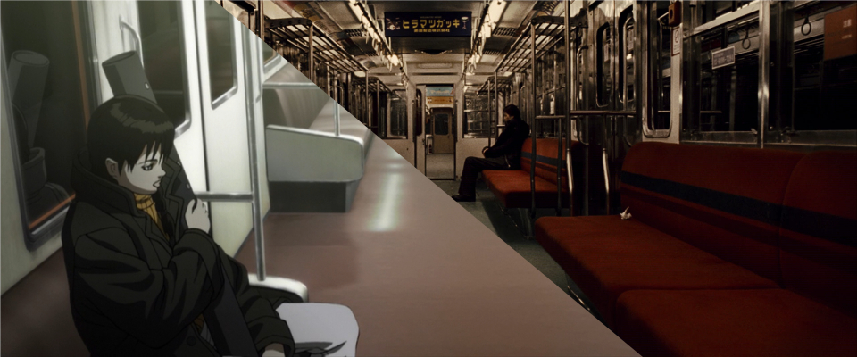
Two women, the main protagonist Alpha with yellow hair and the older Sensei with gray hair, look down on an almost completely flooded city. It’s squeezed between mountains on the right and the sea on the left. At night, you can see it by the streetlights and bright windows of buildings shining through the water.

There are two ways to look at Yokohama Kaidashi Kikō (I mentioned it before). On the one hand, it’s a gentle look at the death of the world. Post-apocalyptic doesn’t have to be violent, cruel, or even unpleasant. We will all die, our cities, our world. So why can’t it be peaceful and beautiful?

You can get the most out of it by watching just 4 short episodes of an animation. The books expand on this and introduce more characters and their stories.

On the other hand, somehow optimistically, it can be seen as a transformation that our world can take – be forced to take – and still be fine. People, even if some of them are robots, will still be doing people things. There would be communities, celebrations, daily work. And maybe it’s better that way.

Summary for June 2024

Bigger on the inside.

There seems to be no consensus on how well mental health is portrayed in Hellblade games, and since I’m not an expert, I won’t say more.

Senua, dressed in leather pants, skirt, and corset, with a sword at her belt, watches the huge burning tree with corpses in tortured poses hanging from its branches.

What I can say is that it leans a little too much towards punishing the protagonist for my taste. It makes the comebacks more powerful, but I don’t know if it justifies the whole thing. To put it another way, I was curious about the first game when it was released, and felt compelled to follow the story in the second, but wouldn’t be upset if I never played both.

For me to consider something problematic, both the good and the bad should be on a comparable level. It’s not perfect, but Doctor Who seems to have been pushing diversity for a while now. I even started watching it after they announced that there would be a female Doctor.

The Doctor, a black man in a long leather coat and blue trousers, and the Doctor&rsquo;s companion, Ruby Sunday, a white blonde woman in a short coat with white fur trim and a dark red tartan skirt, leaning against the TARDIS.

At this point I have watched everything with the Ninth, Tenth, Thirteenth, Fourteenth and now Fifteenth Doctors. Yes, I skipped the Moffat era.

On the other hand, the BBC seems to be pretty bad in many areas. Is it worth it? Well, I don’t give money to BBC, so sure.

The show has a somewhat weird and unique tone, where it tries to be for as much of an audience as it can, so sometimes it can be too silly or simplistic. But the premise means that almost every episode would lead main characters on a pretty unique adventure, and if you like those characters, then at least it would be fun, if not provocative, gut-wrenching or awe-inspiring, which occasionally happens too.